A brand new user experience for UserTesting

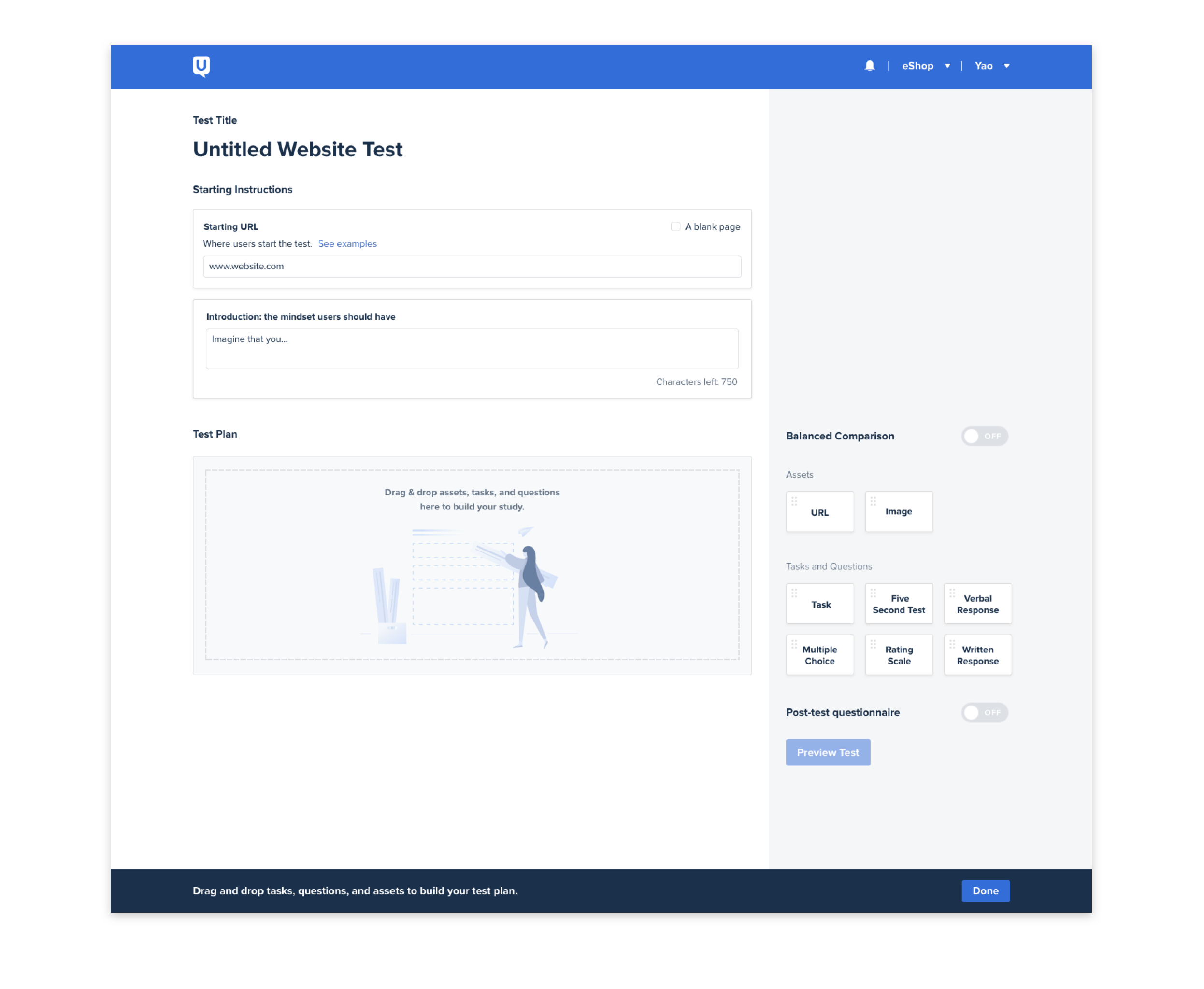
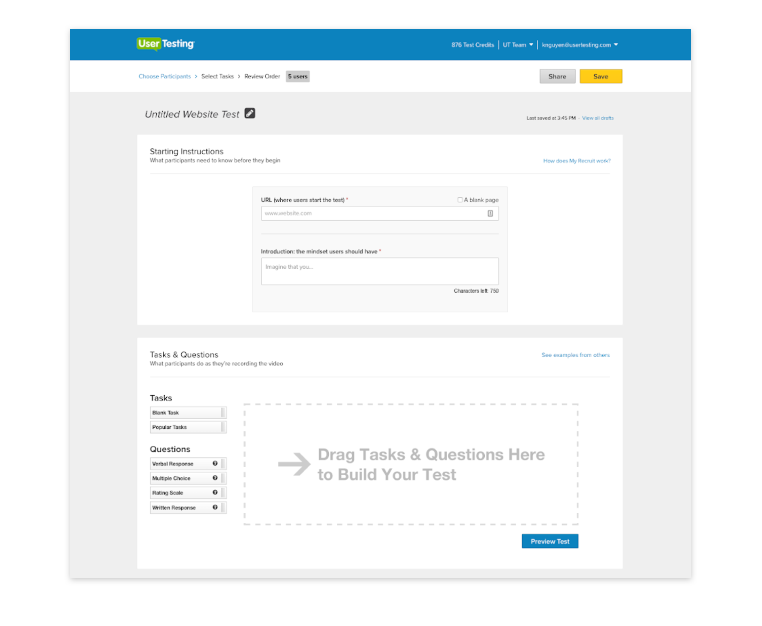
I joined UserTesting in 2017 and sought out to redesign the entire product experience from the ground up as part of design team of 4. The company has been around for literally a decade, but the product experience has remained largely unchanged since 2007.

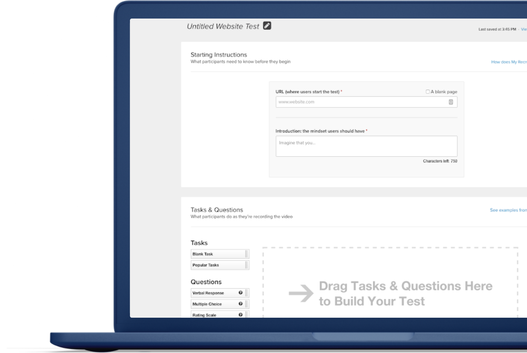
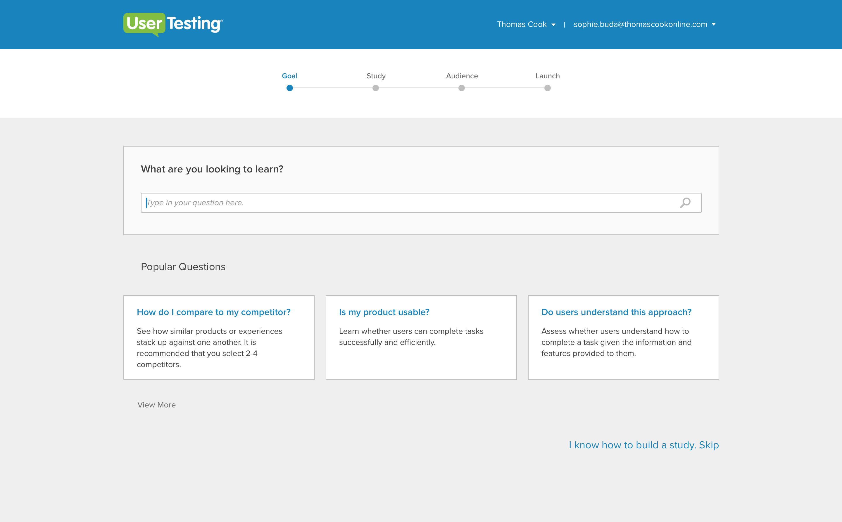
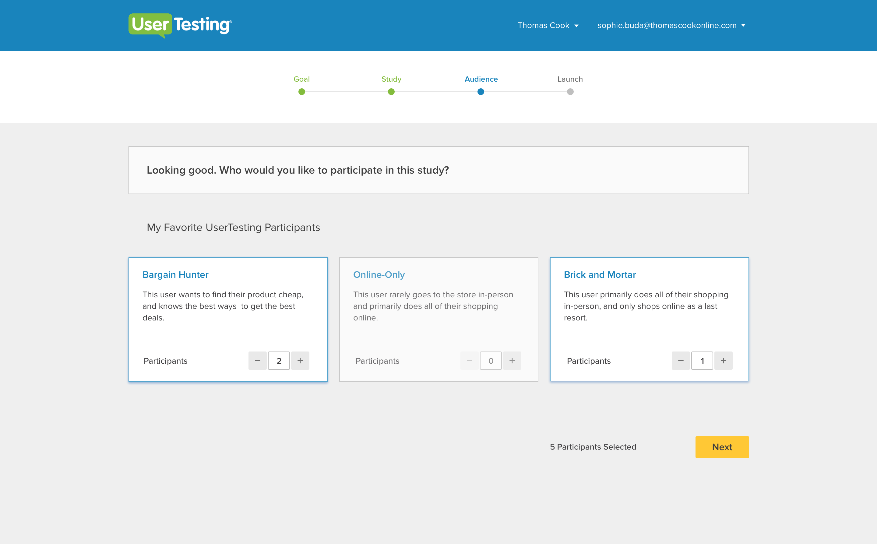
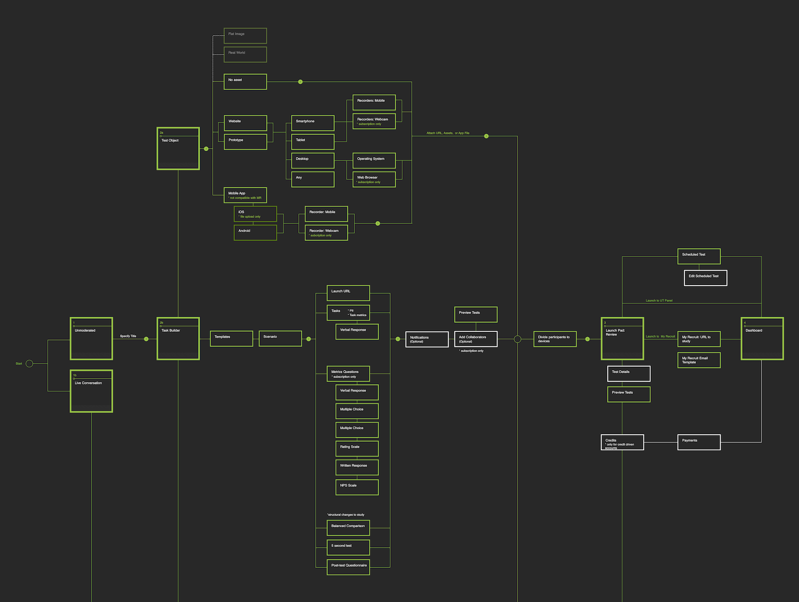
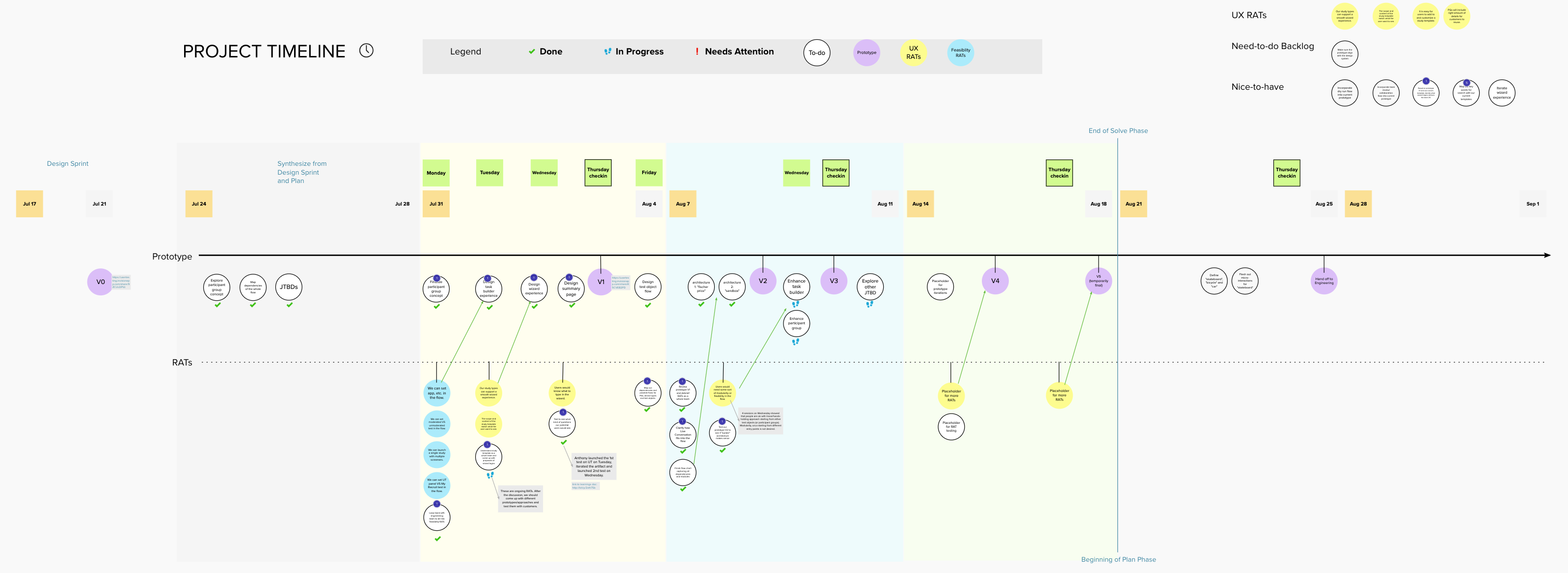
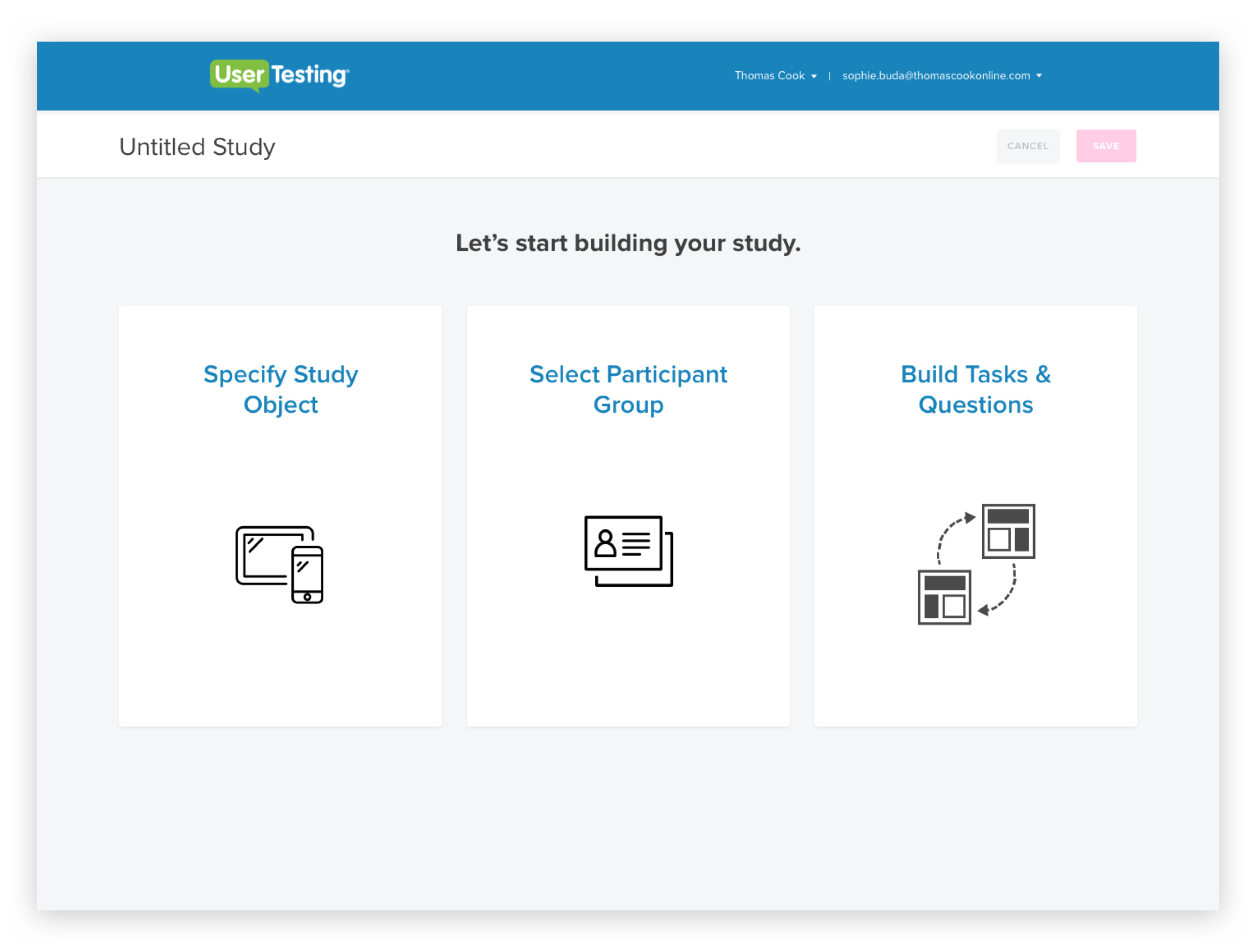
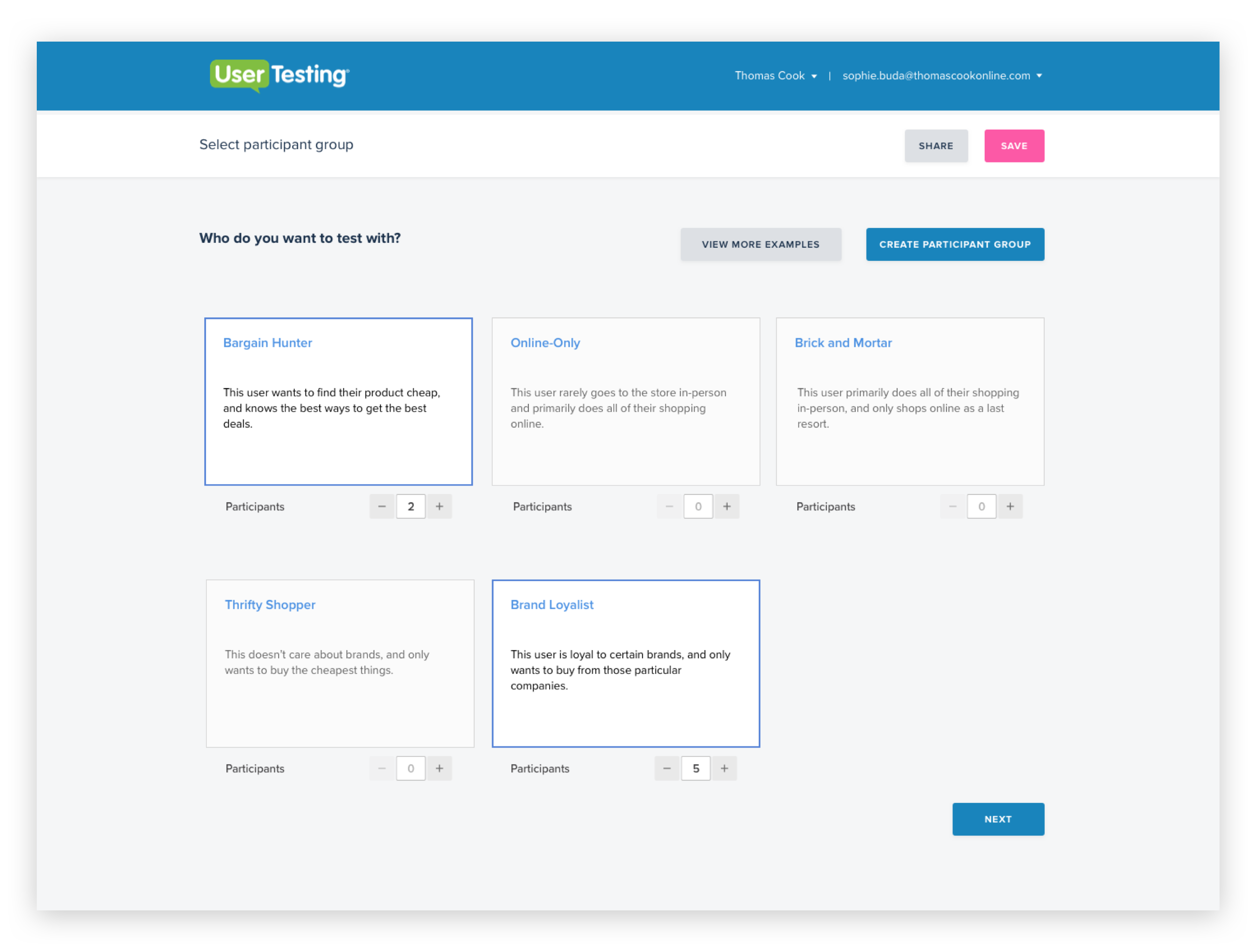
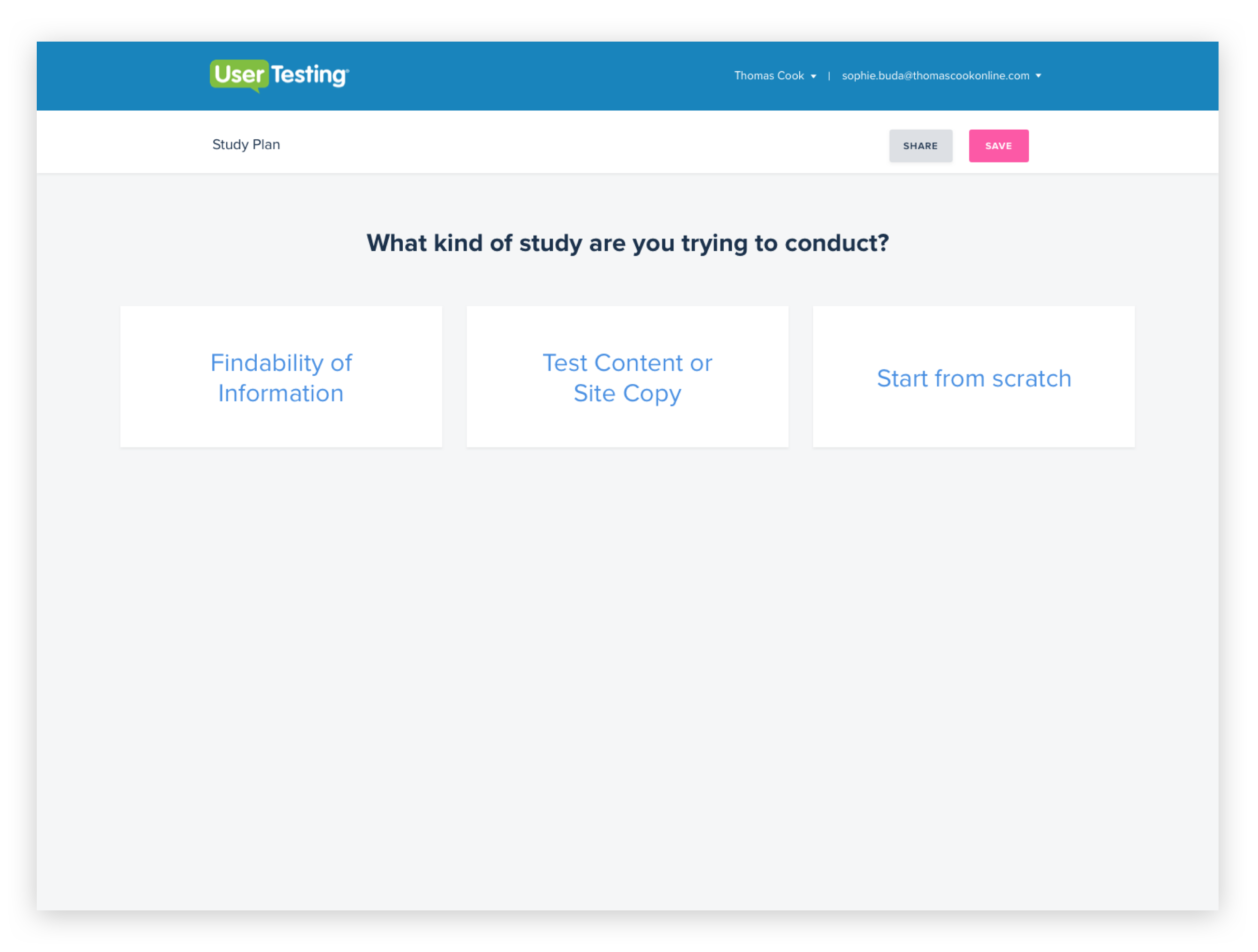
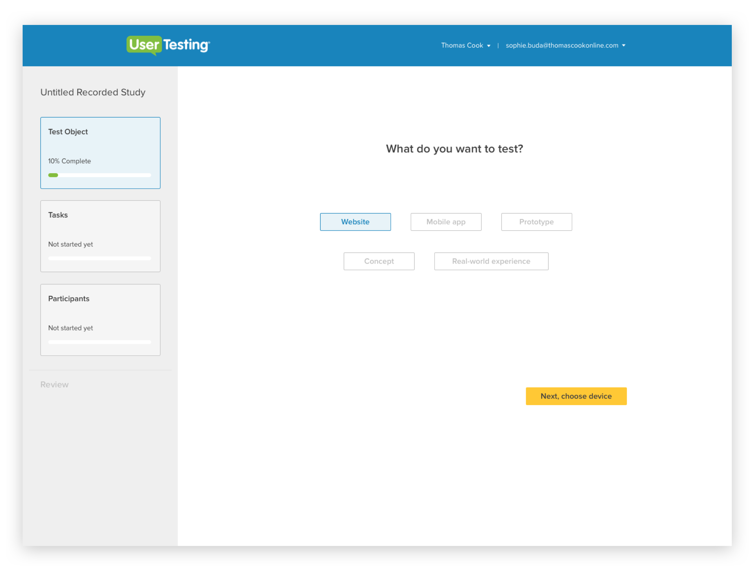
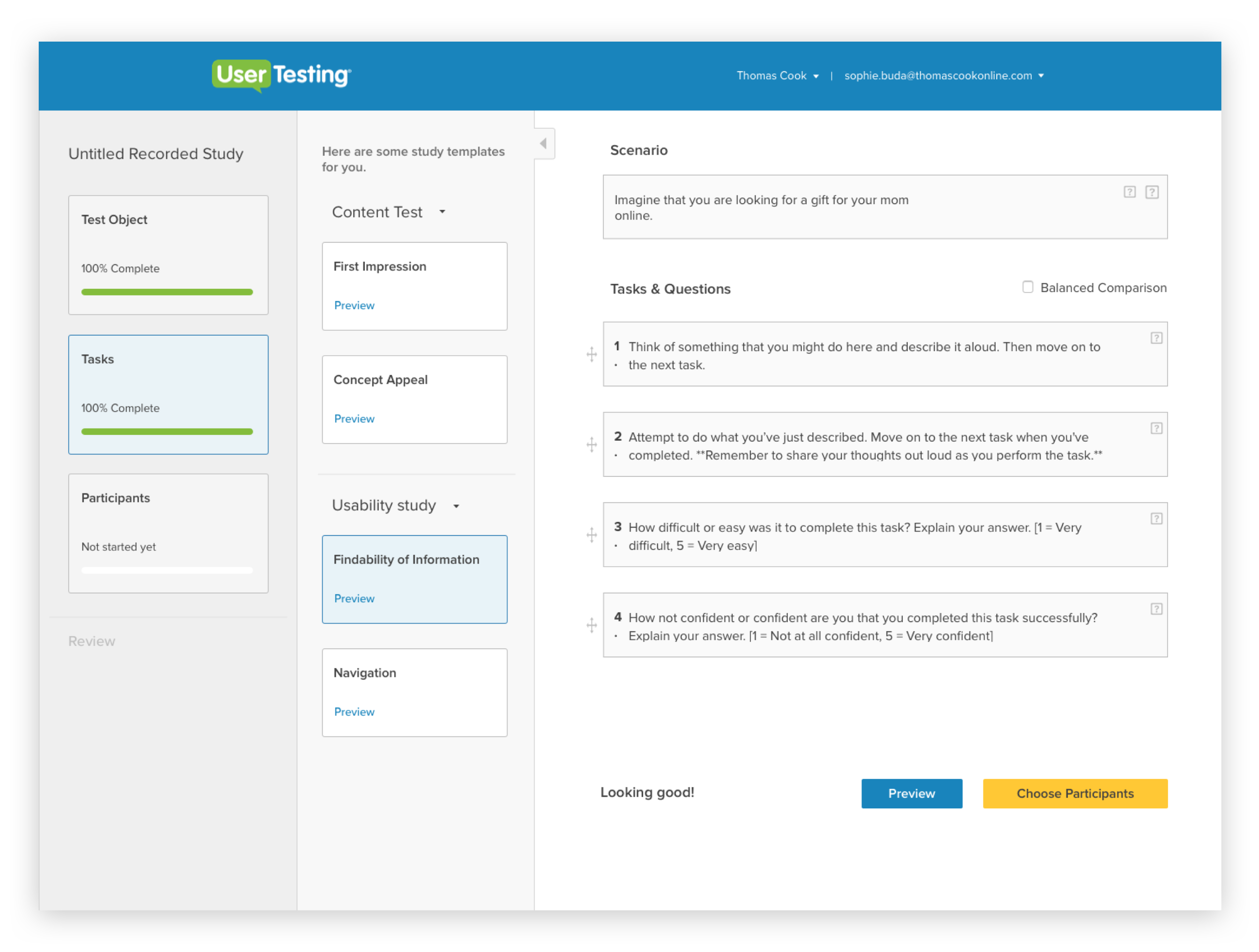
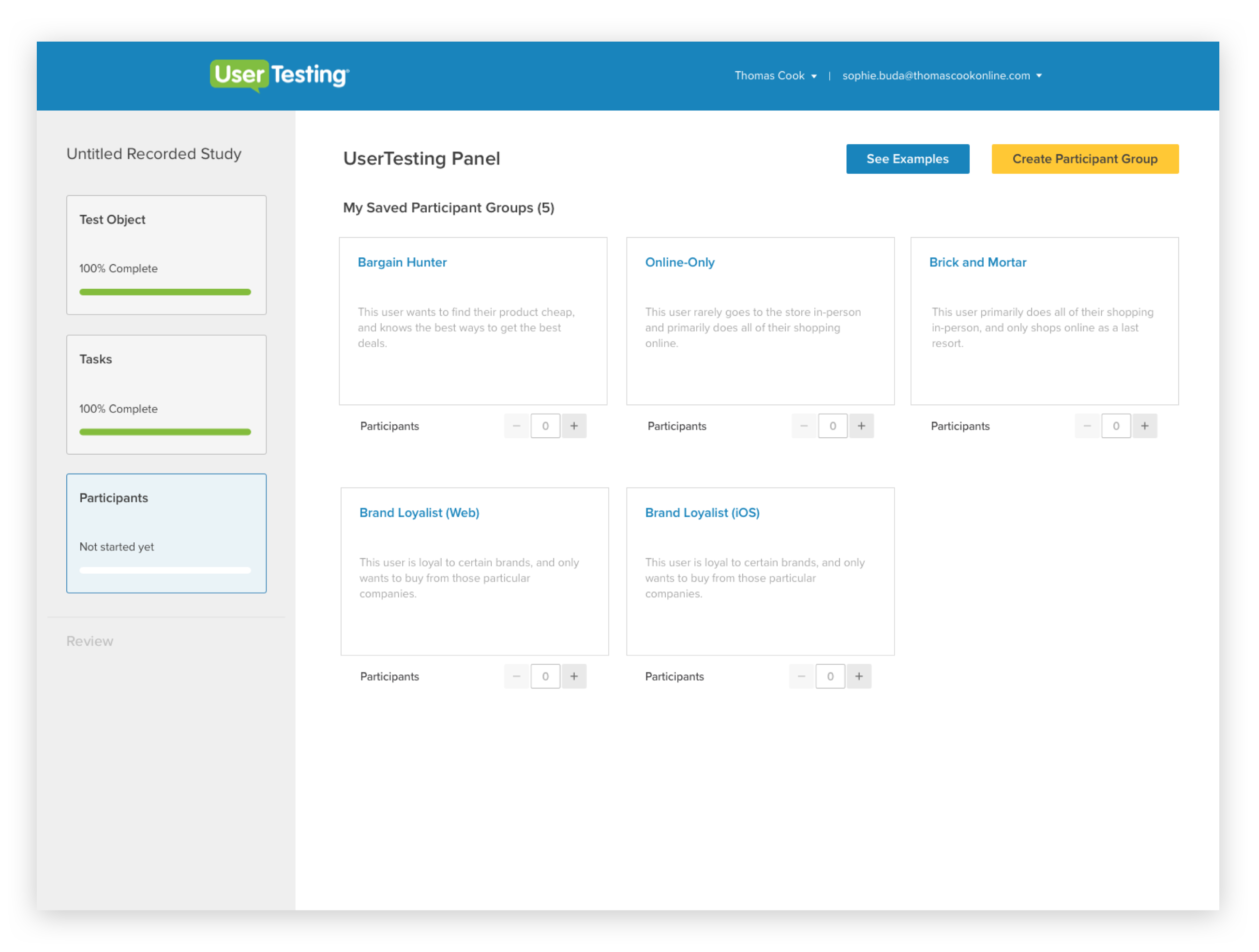
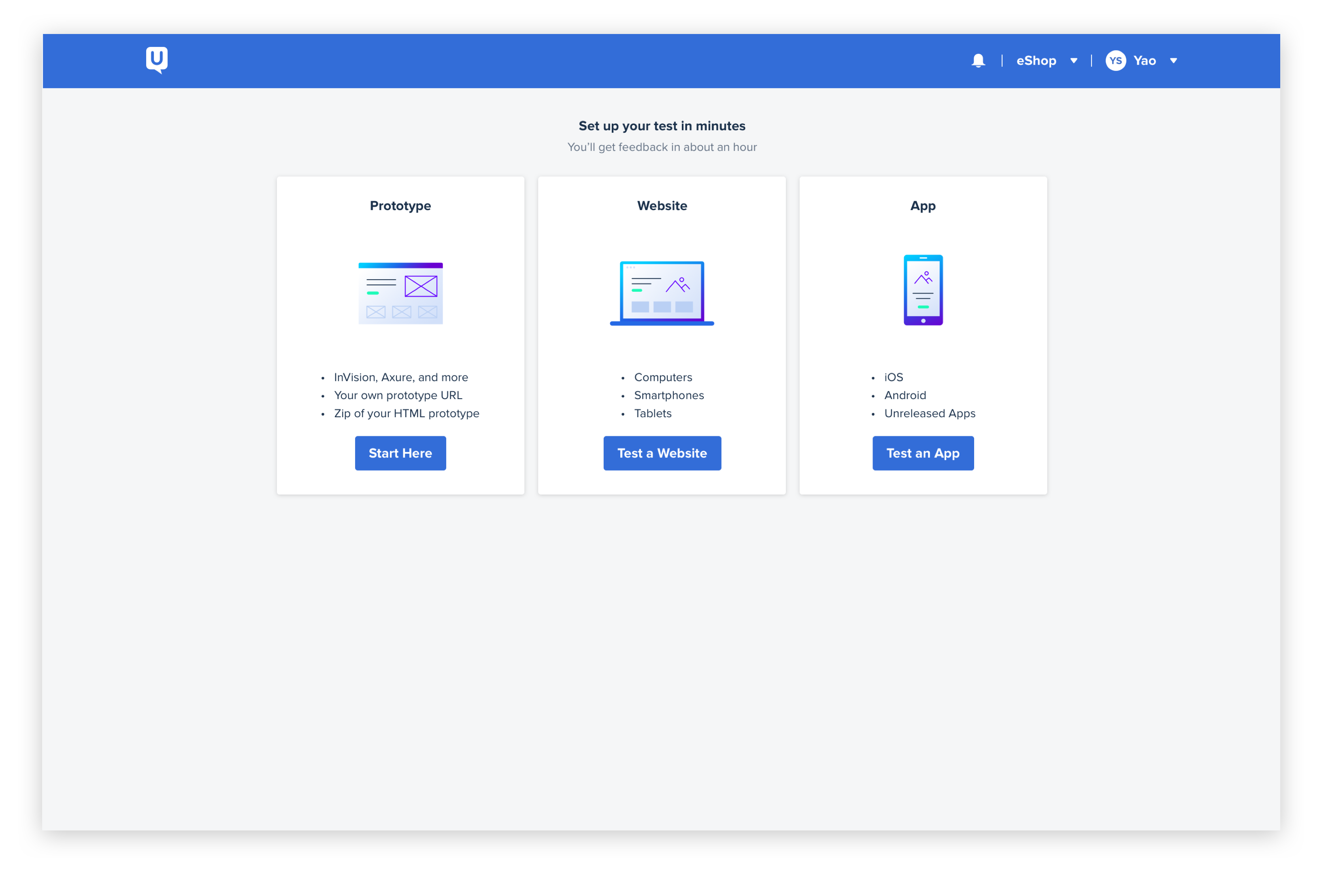
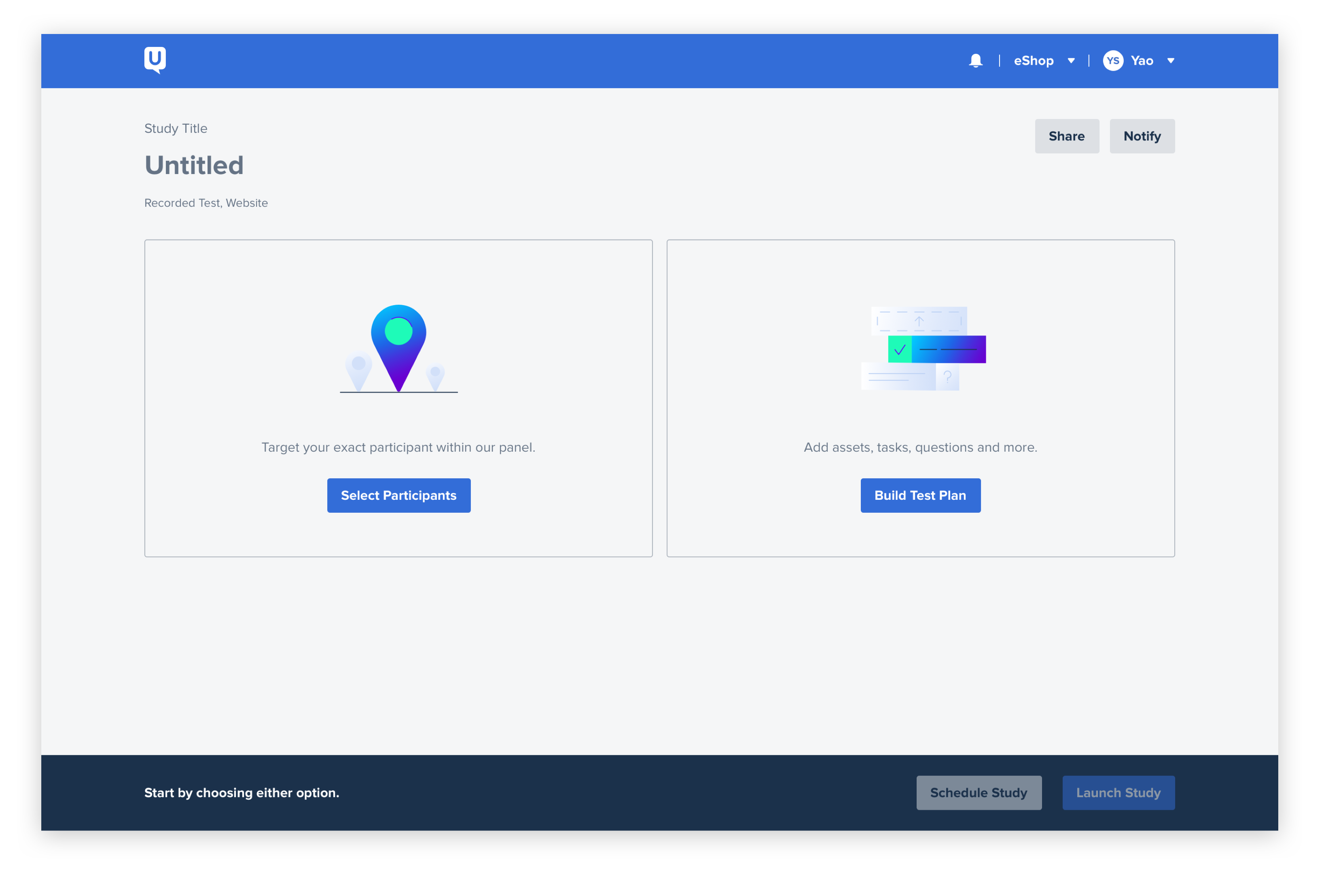
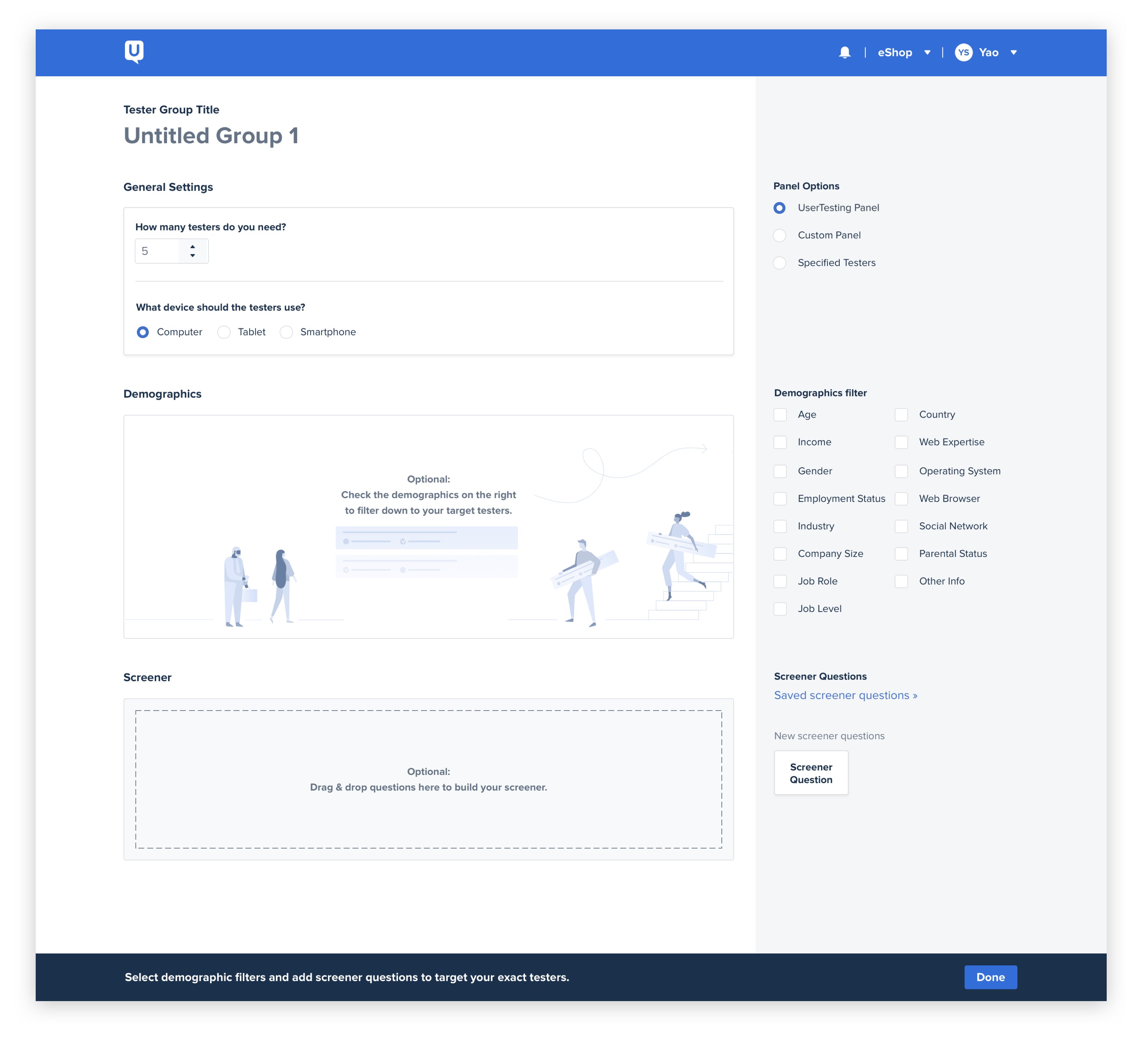
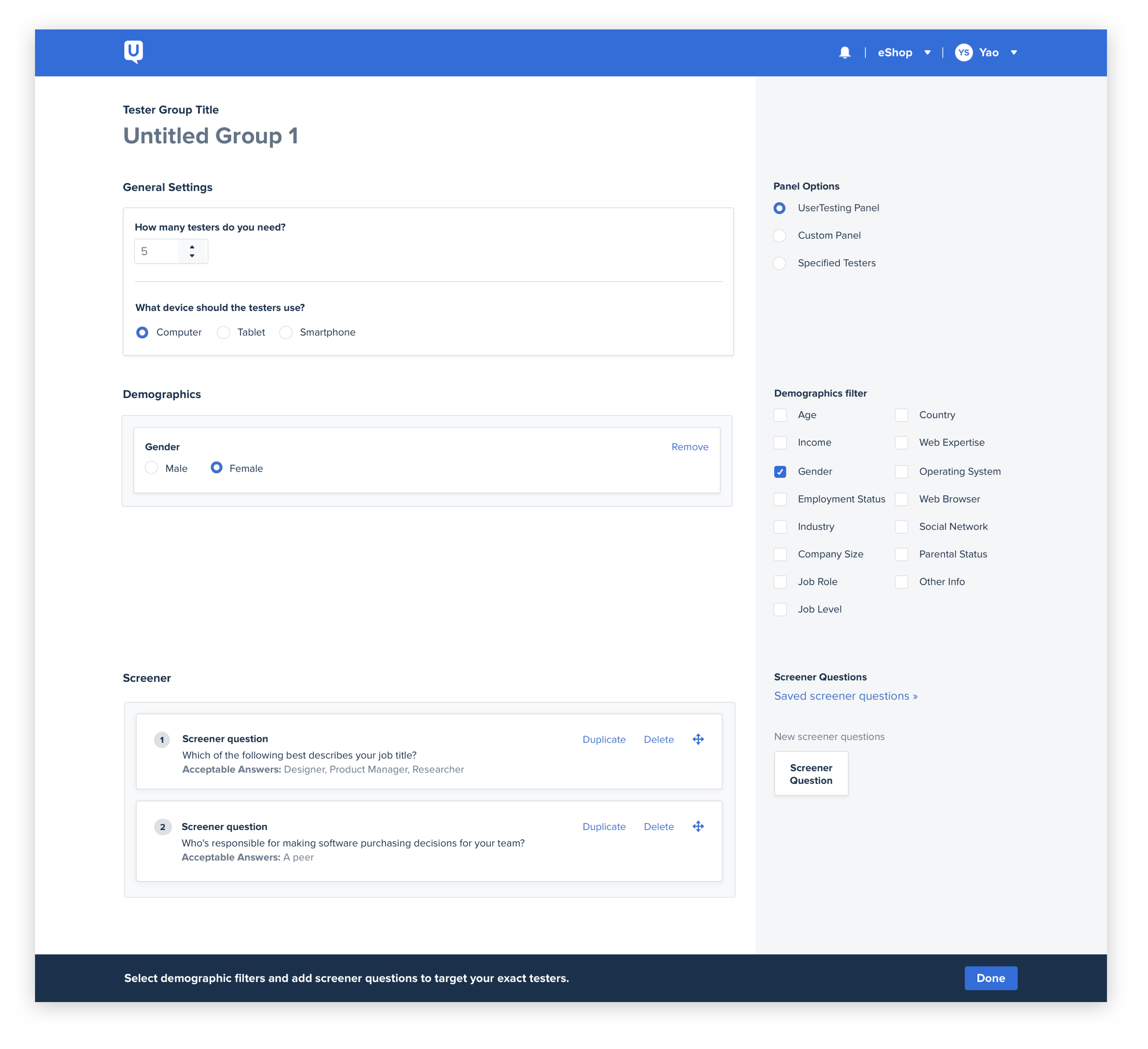
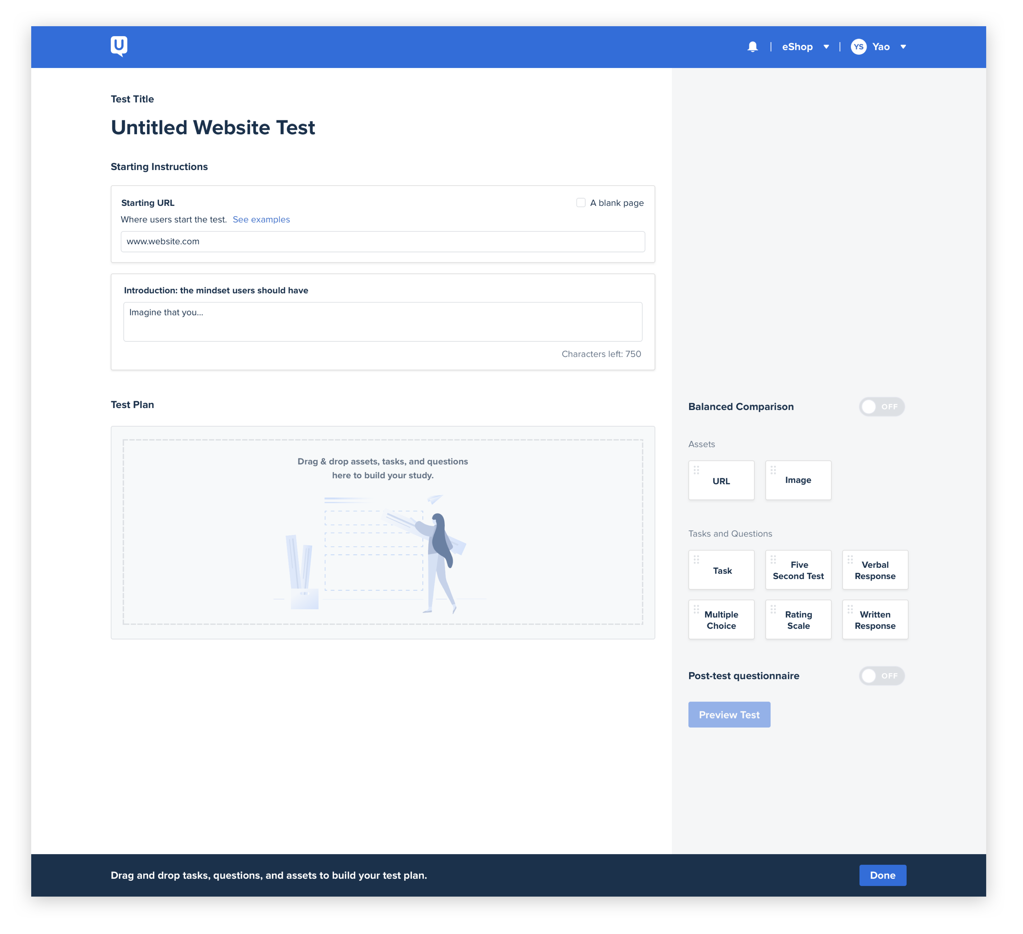
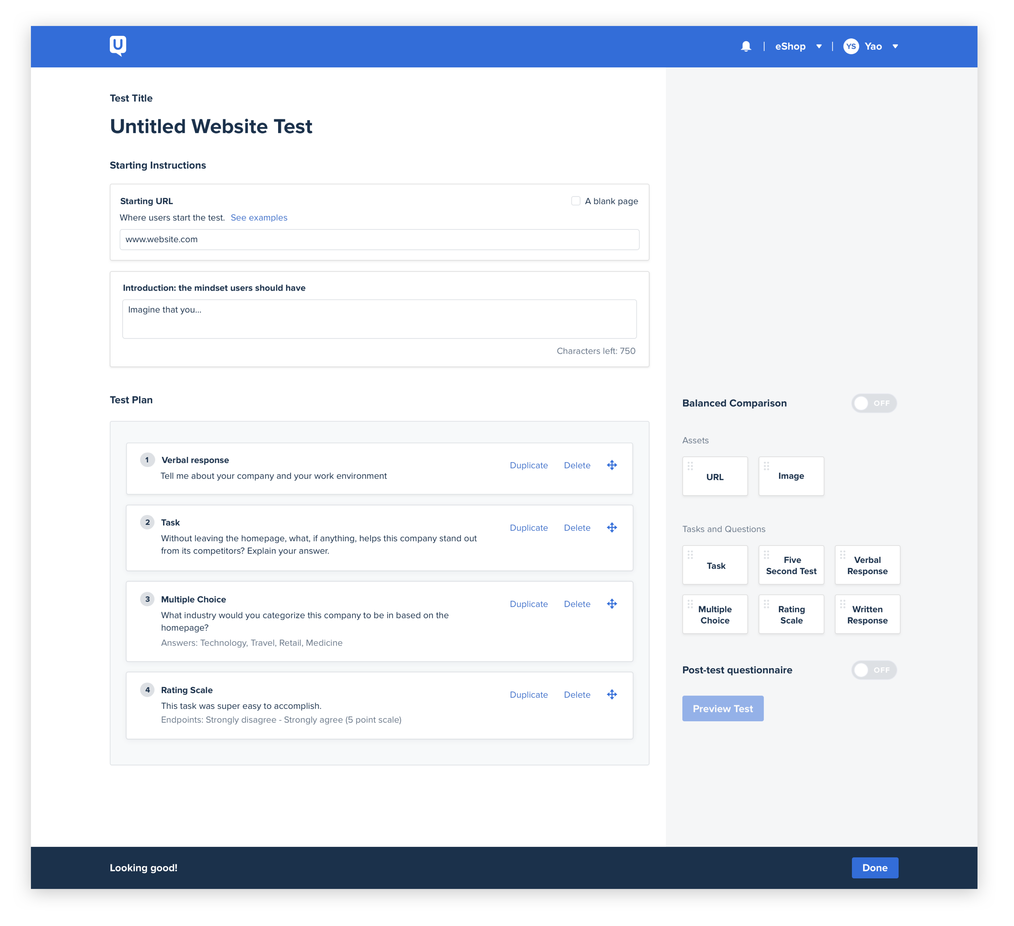
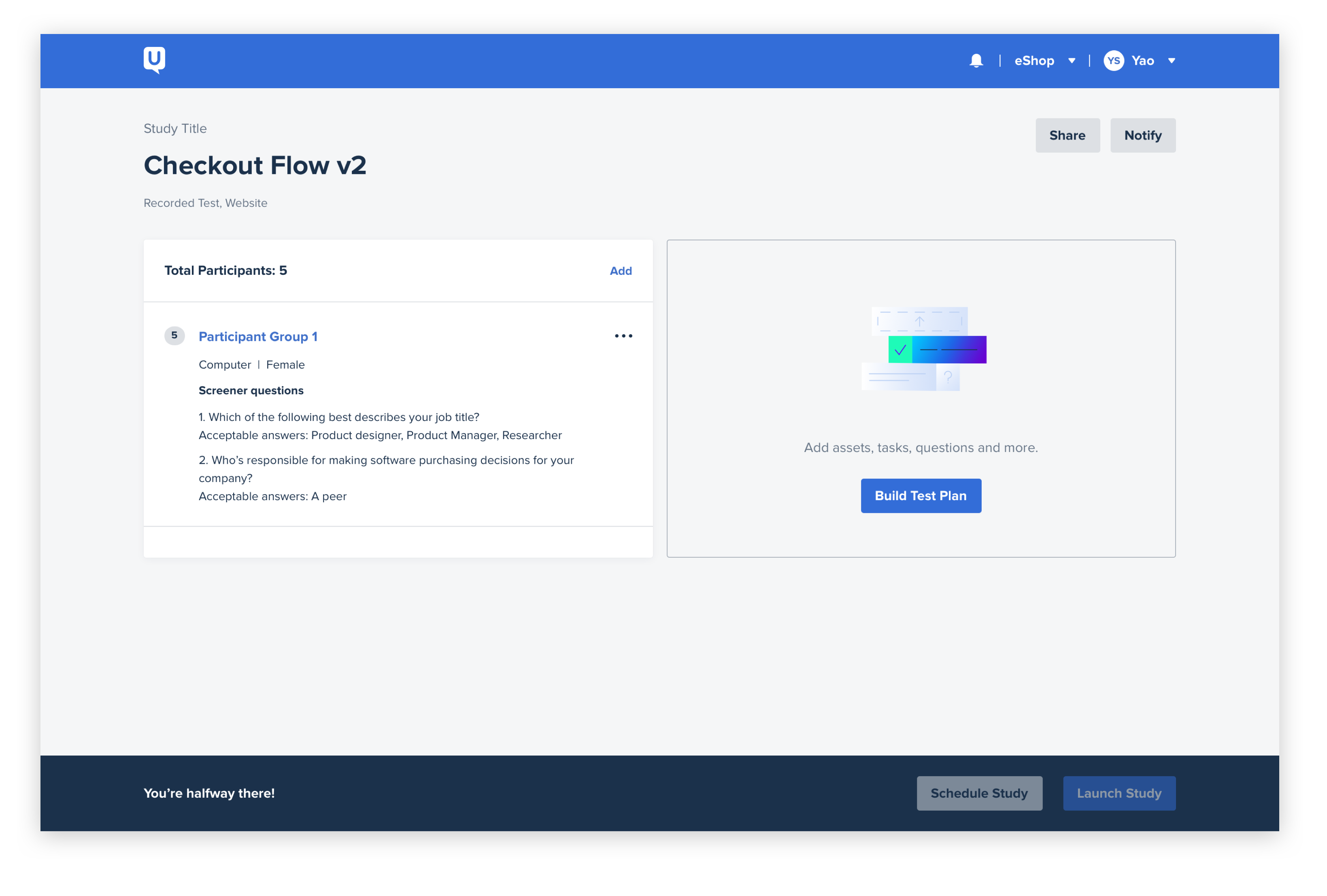
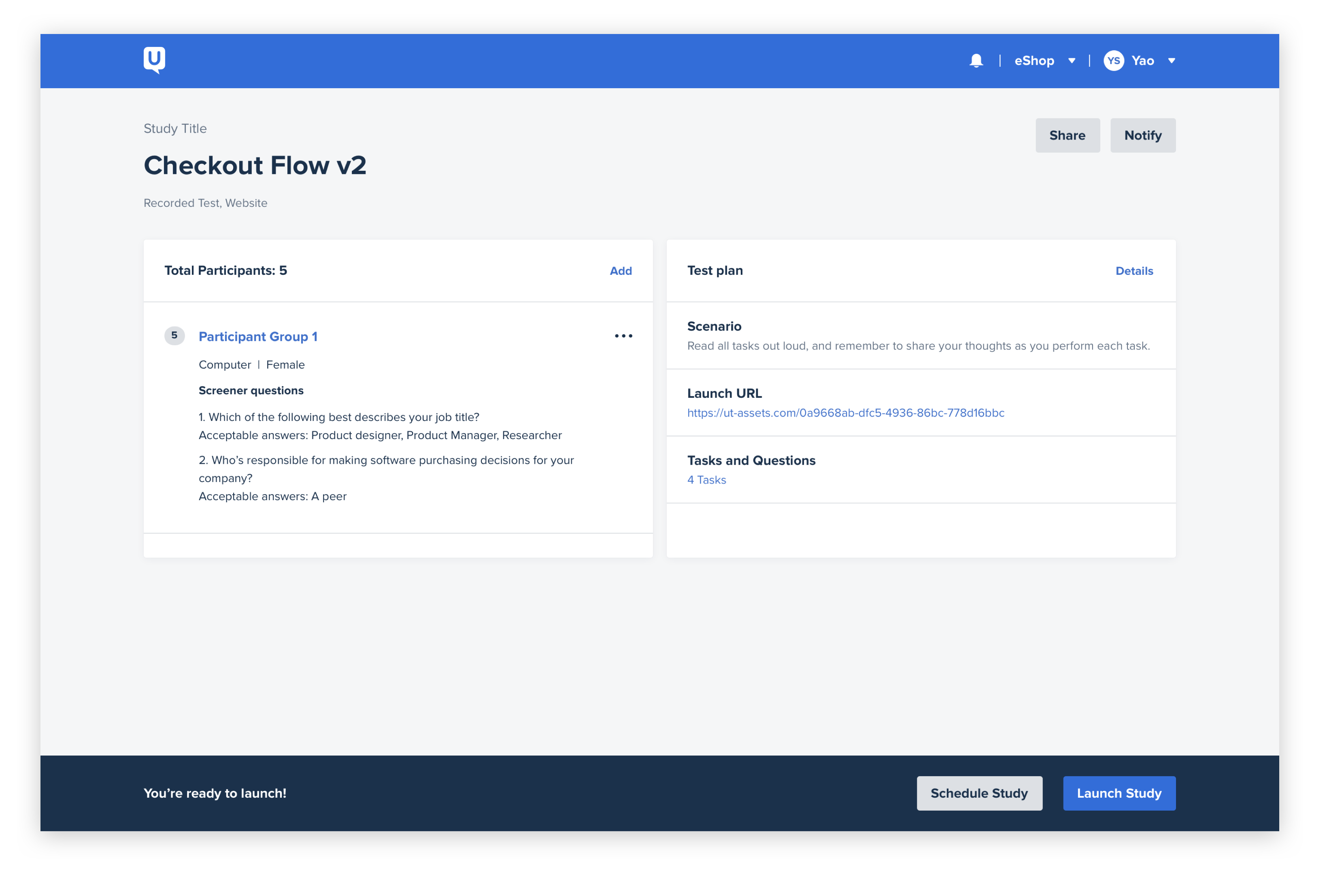
Paired with another product designer, I worked on the biggest chunk of the redesign project, the “study launcher” redesign. This is the product area where customers build their test plans and distribute it to their target audience. Our cross-functional “product developers” followed the burndown framework to help us come to the right solution. The process at its core was a design-thinking and customer-centric approach to how we would design and build an experience that our customers would love. Our goal was to make the experience easier for the research novice users and to create an experience that can catalyze research amongst other team members outside of the traditional UX practitioner. After a year of development, we were able to launch the product and received both praise from our internal partners and from our customers who have tried it out.

The design and technical debt has created many problems for the business…

Product developers want to talk to their own customers in the easiest and most efficient way possible. Many turn to our research platform for their testing needs but are often faced with a large learning curve since the tool is often times daunting and overwhelming for anyone not familiar with how to use it.

From internal feedback solicited from customer-facing teams, the sales and customer enablement team are always hesitant to demo the study launcher to new customers due to it’s bad UX. 30% of customer complaints through our customer loyalty team and website help center are related to confusing UX and that customers don’t know how to use or access certain features. To understand how big the problem is, I collaborated with my data science partner on analyzing the whole experience. We found out that there is huge churn (40%) during test launching process.

Another UX problem about this current cumbersome study launching experience is that, when it comes to  rolling out new features built on top of this experience, it’s often times cluttered in bad UX, which may be responsible for low adoption or discoverability.

It also makes sense from engineering point of view to do this refresh. Since the company’s inception, we’ve accrued a ton of technical debt in this area and has caused development to slow down significantly.

“I mentioned this and others on my team agreed – creating a test is super hard and confusing at times. Have you guys considered user testing UserTesting?”


— Research team @ Amazon

“I observed a ton of usability issues with the test creation process; it’s hard to find all the features you guys have in there. I usually have to spend a few mins clicking things around to know where everything is.”

— Research team @ Microsoft

Design POV

We want to democratize research by making the tool accessible to everyone on the product development team. More people using it outside of the UX practitioner means more tests are created and therefore, more insights consumed. This all feeds into a higher level of engagement that becomes a selling point for us during renewal and sales conversations.

Start: a design sprint where cross-functional alignment happened

Compared to me as a newbie at UserTesting, there are a group of smart individuals who have spent up to 8 years in this company and understand the challenges of study launcher way more. We invited 8 of them from different departments, including sales enablement, qualitative research, engineering, product management and product marketing.

During that one week of sprinting, the team started going into a direction of imagining blue-sky solutions. We landed on a solution where our users could go through a 4-step concierge “wizard” experience to be able to select the right test type and launch their research. Below are the mocks for it. We tested this wizard concept with real users and got positive signals.

After the sprint, we started thinking through the use cases and fleshed out the major workflows. Soon after the engineering team carefully evaluated the solution, they came back and told us that it’s not feasible to finish within 2 quarters, based on our current resources and code-base. We realized that the product and design team has to be more pragmatic toward this project. It bumped us out a bit, but it was a great opportunity to pivot and rethink within the given scope. (The wizard concept then became more of a north-star vision that generally showcased our futuristic thinking.)

Re-evaluating from feasibility point of view

My design partner Kien and I swiftly pivoted to look at the feasibility side of things. We took all the information that we know about our platform, and came up with this chart that mapped to every little single feature that we need to account for when re-designing the study launching project. (The right image is showing only 1/3 of the chart.)

This chart demonstrates how complicated the platform is, and echoed what the engineering team said about complicated connections between features. We realized that the wizard concept is way too blue-sky and cannot support this platform without cleaning up long-tailed features, which is not part of the scope. We then started more focusing on purely how to deliver a good user experience without breaking the current platform structure.

Experimenting designs, (catching all the “RATs”!)

To efficiently design and experiment, my design partner Kien, researcher partner Anthony and I split into 2 tracks in parallel: the other designer Kien focused on mapping out the structure and socializing with other teams; I focused on experimenting different design approaches with research partner Anthony, aka RAT testing (riskiest assumption testing), as shown on the chart above. We would discuss what feasibility, viability and desirability risks that we were facing, and plan for what would be the easiest way to test for that. This core squad met every day to sync and made sure that we aligned on the general design direction.

I was also in charge of making sure that we are hitting the schedule as planned. Below shows how we planned for the whole design process. Of course there were tweaks when we discovered new RATs.

One of the first experiments we did was around the general test launching structure: how to guide the user through concierge test launching process that allows the user to understand clearly where they are and how much more they need to complete at each step of the process?

We came up with 2 different approaches: the launch pad concept (top) and the sandbox concept (bottom). The launchpad concept allows the user to quickly glance through what are necessary for launching a test. The user has the control over what part of the test to tackle first. They can start with the participants part, if they are more familiar with the audience that they are targeting at, and are not sure what kind of research is most suitable yet. On the other hand, the sandbox concept is more of a hand-folding experience, that allows the user to view their progress all the time. It gives the user clear idea of where they are, but is more of a linear process.

Launch pad concept (top) ☝️        Sandbox concept (bottom) 👇

My researcher partner Anthony and I quickly tested the concepts with 4 existing customers and 2 new customers. Both concepts achieved the goal of providing clear guidance to the user. Between the two, the launch pad concept really speaks to the research novice users, and that was the one we chose to pursue in the end.

I like the feeling of essentially cue cards or task cards where you're clicking on it and completing something, then it flips over and represents that's done. I think that's very engaging -- kind of like a game. I like it.

HW, PMGirl Scouts of the USA

Drive home the modularity concept and gaming look and feel

We did 12 rounds of RAT testing on the design iterations. From this process, what really stands out in customer feedback as guiding principle is the modularity piece and gaming look and feel. However, there is a fine balance between keeping this enterprise platform professional and the interactions fun and engaging.

We’d like to drive home the modularity concept throughout the whole experience. On the launchpad, the user is able to choose whatever module that they want to start with first. After going into either module, which is either participant group builder or test plan builder, the user is presented with cards on the right side bar, containing tasks and screener questions that they could drag and drop onto the canvas. This interaction also is highly accepted in our testing and in Beta launch. After the user completes each canvas, they are able to come back to the launch pad with contextual prompt letting them know when it’s ready to launch the test. The whole experience is more hand-holding compared to the previous linear rigid approach.

(During study launcher project, our product was also under major design system refresh. Every single design iteration was also a testing opportunity for our new design language. Below is the final outcome that went GA.)

Go-to- market strategy and success metrics

3
Build phases
87
Beta retention
14
MAU
70
Tests launched per month

To make sure that the consistent design language is carried through the whole entire experience, we first finished designing for the happy paths and major use cases. In collaboration with PM, engineering and product marketing, we rolled out the launch pad as the first slice. We continued building the participant group editor and test plan editor, and gradually launched every piece in Beta. Throughout Beta, the new study launcher got a 87% retention rate. After we have gained enough feedback and positive signals, we released it to GA.

Qualitatively, this redesign has been a huge success. In the beginning, just like every product refresh, we heard certain power users (mainly internally though) complaining about having to adjust to the new look and navigational elements, but soon after the user gets used to the new look, they told us that “they would be disappointed if they have to roll back to the old interface”.

Throughout the refresh, the team also paid down all technical and design debt and laid a strong foundation for the company to build more things off from.

I like this new design for this page. Much cleaner and understandable.

MT, UX ManagerPitney Bowes

I really like the changes to the interface. It doesn't look like anything new was added or taken away, just a new friendlier interface.

SR, Senior ResearcherRedventures

I just set up my first test from scratch in the new test launcher experience and it's awesome! I hope you're feeling like a rockstar!

MK, Director of Product ResearchUserTesting

OMG NEW STUDY LAUNCHER LOOKS SO GOOD. Just got off a demo where the prospect enabled it and he definitely ‘got it’ really quickly.

DP, Director of Solution ConsultingUserTesting

Reflection and learning

First, building B2B software requires a lot of thinking and negotiation when it comes to filtering and selecting user feedback and engagement data. The company’s business objective plays an important role on this selection process. Naturally our business transitioned from pay-as-you-go model into subscription model, so that we needed to focus more on enterprise subscription users’ behaviors.

For a major redesign project as it is, study launcher project has faced a lot of unsolicited feedback and different voices, especially from internal teams. Going through this whole process made me realize that building design culture doesn’t happen overnight. It takes a lot of small victories and slow inception of ideas that starts from small conversations with team members outside of design. In this process, having a strong rationale behind every decision you make and make sure you validate it internally and externally is extremely crucial when it comes to socializing ideas. The customer facing team’s feedback is just as important as the customers themselves.

I also reflected on the design process, started with the expensive design sprint. The concierge concept that came out of it didn’t directly contribute to the current problem we are solving for, as mentioned earlier. Though we had engineers in the sprint, the team were not focusing on a feasible solution that could be done within 2 quarters. Lesson learned there is that any brainstorming and alignment session needs to be carefully facilitated with a clear expectation. What happened afterwards is that my design partner Kien and I had to take a step back and re-evaluate the whole situation. The positive side of it though, is that with this north star vision, the whole company feels more aligned on the future product line, and gets more motivated when dealing with current challenges day-to-day.